
Why is the American public so ignorant about economics? Maybe it’s because pundits so often manipulate the numbers.
There’s a new meme orbiting the economics policy world: if Americans really understood just how unequal this country was, they’d choose to live in a place like Sweden. That we’re worried about inequality is not a surprise, almost any set of numbers shows it’s growing. The new weapon in the debate, though, is a study showing that when they actually look at the data more than 9 in 10 Americans would take the Swedish economic model over what we’ve got.
The New York Times this week kicked off a roundtable debate on rising inequality with the remarkable results of this study, by Michael I. Norton of the Harvard Business School and Dan Ariely of Duke. Their findings are indeed startling. But the authors have massaged the results. In fact, the survey may end up telling you a lot less about inequality than about the quality public debate about the economy.
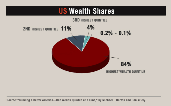
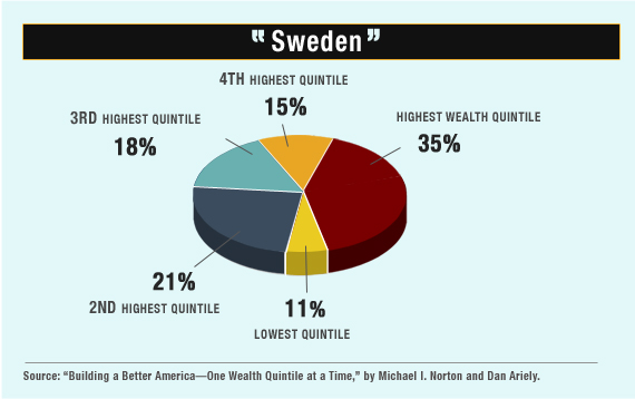
The Norton-Ariely survey asked folks to look at several pie charts of wealth distribution. One of these mirrored the actual distribution of wealth in the US, with 84 percent in the hands of just the top fifth. Another pie chart showed a country where wealth is much more evenly spread out—one that Norton and Ariely describe in their paper (though they didn’t say so to the subjects) as being “like Sweden.”
The result: 92 percent of Americans preferred to live in a country where wealth was split as it is in the “Swedish” pie chart. (A third option, with perfectly equal shares for everyone, was somewhat less popular.) Cue outrage about how Americans really want equality but have been snookered into putting up with massive disparities of wealth.
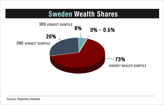
What’s wrong with this picture? Look at the next pie chart. It’s the actual distribution of wealth in … yes, Sweden. It looks absolutely nothing like Norton and Ariely’s pie chart. This one is based on the Swedish government’s tax records for 2007 which the Swedish government helpfully makes available in English.
If anything, the chart understates Swedish wealth inequality, excluding money held off shore, the value of family owned firms, and the considerable wealth of super rich Swedes, like Ikea founder Ingvar Kamprad who left the country to avoid taxes.
Even without considering all that, the real Swedish chart looks much closer to the one from the United States. More than 90 percent of the wealth is in the hands of the top two fifths of households. Notably, there’s no section of the pie at all for the bottom fifth, because 30 percent of Swedish households have a net worth of less than zero.
What Norton and Ariely did in their paper was take the distribution of incomes in Sweden, which every economist knows is always more evenly distributed than assets, and compared it to the American distribution of wealth. It’s easy to see why the numbers for wealth—which for many people is just another word for “savings”—invariably look a lot less equal than those for income. Just about everywhere, most people do have an income, but as you go down the economic ladder, few can put much of it away for the future.
Ariely admits that, “We created a more equal society than the most equal society in the world,” in order to give people a meaningful and relatively difficult choice. He thinks that if people had been given the option of taking wealth distribution that looked slightly more equal than that of the United States, virtually everybody would choose it over the current US situation. “We made things harder for ourselves,” Ariely contends.
They’ve also made it harder for anyone trying to evaluate realistic economic policies. You wouldn’t guess from the coverage of the study (it elicited 9,000-plus comments in the Huffington Post) that, as Norton concedes in an email, “It’s hard to find any country that has a particularly equal distribution of wealth.”
That might make you wonder if we’re really evaluating national wealth the right ways. In fact, the real Sweden gives you some good reasons to think that measuring assets gives you a very incomplete picture of equality. It’s no surprise that poorer Swedes save little or nothing. With a strong social safety net and pension plans, they need to save less than Americans. Norton and Ariely could easily have said this. Many folks (yes, even Americans) might prefer the Swedish model on its merits.
The effect of this and other economic research isn’t to prompt debate. It’s to shock people with numbers, even if they’re made up. Even as Norton and Ariely bemoan that Americans “vastly underestimate” the level of economic inequality, they sprinkle the dust of confusion over the debate.
Ariely says that the paper wasn’t really about comparing the US to Sweden anyway, just about eliciting answers to hypothetical choices. “Would it make you happier if we had put ‘Sweden’ is quotes?” he asked me when we discussed his paper, “Maybe we should have put it in quotes.”
Ariely knows, however, that the ultimate value of hypothetical choices is in making real policies. His co-author makes no bones about that. This week, Norton wrote that he and his colleagues are now exploring “whether educating Americans about the current level of wealth inequality (by showing them charts and pictures) might increase their support for policies that reduce this inequality.”
Sure it might. There are real reasons to be concerned about the concentration of wealth. But the word for doing this by piling on misconceptions about inequality isn’t “education.” It comes very close to “propaganda.”
Related links:
Why We Can’t ignore growing income inequality (Slate)
Sweden’s Tiger Economy: Is All What It Seems? (The Wall Street Journal)
Income Inequality: Where Do You Fall? (PBS Newshour)


