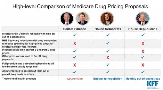
Chart of the Day: Drug Price Plans Compared
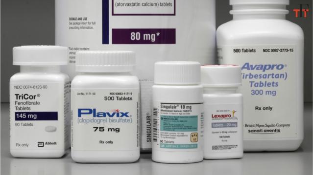
Lawmakers are considering three separate bills that are intended to reduce the cost of prescription drugs. Here’s an overview of the proposals, from a series of charts produced by the Kaiser Family Foundation this week. An interesting detail highlighted in another chart: 88% of voters – including 92% of Democrats and 85% of Republicans – want to give the government the power to negotiate prices with drug companies.
Congressional Report of the Day: The US Pays Nearly 4 Times More for Drugs
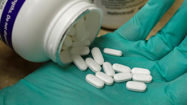
The House Ways and Means Committee released a new analysis of drug prices in the U.S. compared to 11 other developed nations, and the results, though predictable, aren’t pretty. Here are the key findings from the report:
- The U.S. pays the most for drugs, though prices varied widely.
- U.S. drug prices were nearly four times higher than average prices compared to similar countries.
- U.S. consumers pay significantly more for drugs than other countries, even when accounting for rebates.
- The U.S. could save $49 billion annually on Medicare Part D alone by using average drug prices for comparator countries.
Read the full congressional report here.
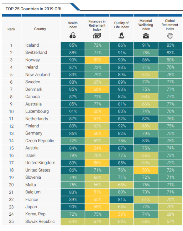
Chart of the Day: How the US Ranks for Retirement

The U.S. ranks 18th for retiree well-being among developed nations, according to the latest Global Retirement Index from Natixis, the French corporate and investment bank. The U.S. fell two spots in the ranking this year, due in part to rising economic inequality and poor performance for life expectancy.
About 90% of Trump Counties Have Received Trade War Farm Aid

President Trump won more than 2,600 of the nation’s 3,000-plus counties in the 2016 election, and residents in nearly 90% of those counties – or more than 2,300 – have received some level of aid from the administration’s Market Facilitation Program, a $16 billion effort that compensates farmers for losses incurred as a result of Trump’s trade war with China.
Drawing on a new report from the Environmental Working Group, The Washington Post’s Philip Bump says the data “show the extent to which [the farm] subsidies overlap with Trump’s base of political support.”
To be fair, about 80% of the counties Hillary Clinton won also received some degree of aid, Bump says, but there are many fewer of them, given the concentration of her supporters in urban areas.
Overall, residents in more than 2,600 counties in the U.S. have received payments from the farm aid program, with the heaviest concentration in the Midwest.
Number of the Day: $1.57

A new study from the Bipartisan Policy Center says that Medicare would save $1.57 for every dollar it spends delivering healthy food to elderly beneficiaries who have recently been discharged from the hospital. The savings would come from a reduction in the rate of readmissions to the hospital for patients suffering from a wide range of common ailments, including rheumatoid arthritis, congestive heart failure, diabetes and emphysema.
“If you were going to offer meals to every Medicare beneficiary, it would be cost-prohibitive,” said BPC’s Katherine Hayes. “By targeting it to a very, very sick group of people is how we were able to show there could be savings.”
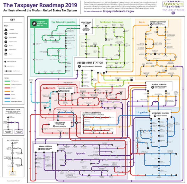
Map of the Day: Navigating the IRS

The Taxpayer Advocate Service – an independent organization within the IRS whose roughly 1,800 employees both assist taxpayers in resolving problems with the tax collection agency and recommend changes aimed at improving the system – released a “subway map” that shows the “the stages of a taxpayer’s journey.” The colorful diagram includes the steps a typical taxpayer takes to prepare and file their tax forms, as well as the many “stations” a tax return can pass through, including processing, audits, appeals and litigation. Not surprisingly, the map is quite complicated. Click here to review a larger version on the taxpayer advocate’s site.